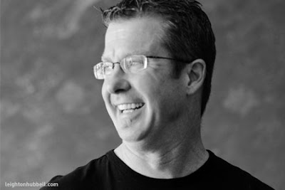
My name is Leighton Hubbell. I'm the guy behind the one-person design shop, Leightonhubbell.com. I've been designing logos, corporate identity systems, promotions, packaging design, illustration, print, web design and television for over 20 years. Throughout my many adventures, I've worked with one-person entrepreneurial companies, education facilities, nonprofit organizations, government agencies and major international corporations.
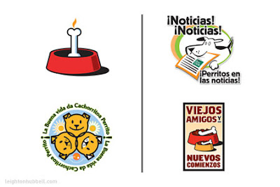
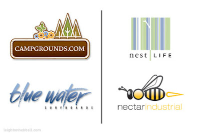
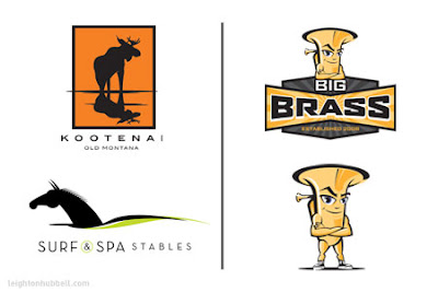
Even with such a diverse set of design skills, I am most widely recognized for my logo design work. I've somehow lost count, but I'm sure there are literally thousands of logos in my archives that I have designed for this client or that. Clients have included businesses and organizations throughout the United States and other foreign countries. Larger clients have included Sheraton Hotels, Purina Pet Foods, Hanes USA, Lions Club International, Nestlé USA, Samsung and many others.
I have received over a hundred regional, national and international awards for my advertising, logo design, graphic design and illustration efforts. My work has been featured in HOW, Print and Graphic Design:USA. Over two dozen books on the design of logos, identity, and graphic design have presented my efforts as industry examples.
Portfolio: http://leightonhubbell.com
Blog: http://leightonhubbell-blog.com
Company: http://hubbelldesignworks.com
Twitter: http://twitter.com/leightonhubbell
Facebook Fan Page: http://bit.ly/kdBtV
When did you first decide to become a graphic designer/ illustrator? Was there a pivotal moment?
I had always been interested in art since I was very young. My parents were always very encouraging with my creative abilities – anything from sculpture to drawing to painting. My great grandfather was a label and packaging illustrator in the Santa Clara Valley of California.
It was probably when I was about 12 years old when I thought I might want to be a 'commercial artist'. There was an older student at my school that was a very good artist. He was kind of the 'rock star' of his senior class and everyone knew how good he was. In his senior yearbook entry, he said his goal was to go into commercial art. I don't think I was entirely sure what that was, but it sounded like I could be an artist for a living. From there, I always worked on my goal and continued to take art and drafting classes in school and had a few private lessons.
Before I graduated from high school, I knew I was going to go to art school somehow and worked toward getting accepted. I went to a year of community college to find out more about the field and soon found out that the assignments were challenging and fun. From there, I went on to art school with a much more direct focus and very excited about the future.
Who or what inspires you?
I had a lot of different influences that got me interested in art and illustration. Some of my favorites are MC Escher, Salvador Dali, Andy Warhol, Chuck Jones, Paul Rand and the Bauhaus. Current designers and illustrators I admire are Michael Doret, Michael Schwab, Lou Brooks, Neville Brody, Von Glitschka and many, many others.
I have a wide range of interests including old WPA and vintage show posters, typography, packaging, painting and digital art as well. Naturally curious on how things work, I love to find out how to make, construct and do things. I gotta be the one behind the scenes.
Where does your training come from? Self-taught? College/Art School?
Well, as I mentioned before I have been doodling and tinkering with art for most of my life. But, my formal training was graduating from the Colorado Institute of Art in graphic design and afterwards graduating from Art Center College of Design in Pasadena, in advertising design.
Although both of those programs are very focused on the specific major, I took additional courses in illustration and rendering in addition to my curriculum work.
When I graduated from CIA in 1987, photo-realistic airbrush illustration was all the rage. I didn't really fit into that style, so I kind of gave up on that and focused more on design. I still missed it though. It was only later that I realized that there was a place for my style(s) of illustration and rendering within the industry and to possibly rethink my direction.
Over the course of my 20+ year career, I began as a graphic designer, worked my way up in advertising, then promotions and then, back to graphic design. My first job was still using the traditional photostat camera and darkroom setup–artboards and everything. Some time after that, the computer was gaining ground as a graphic tool. Because of the type of design we did and the imagery we had available, I would sometimes use my own illustrations in my work. Over time, colleagues of mine were asking if I would do some illustration for their design work.
Eventually, I took the plunge and started marketing myself as an illustrator. Because of my strengths in design and my rather illustrative style, I had adopted the term 'illustrative designer' from some others with very similar skill sets in the industry. I didn't invent the term, but it seemed to fit me pretty well.
How do you keep "fresh" within your industry?
I do love to collect art books and am a voracious magazine reader–much to the chagrin of my wife. I like to collect different images and objects and paste them into my sketchbooks for reference later. Stuff like type treatments, illustration work, logos, icons and interesting photography. I even collect receipts, notes - whatever. It's much easier on the brain, than trying to remember everything cool you've seen. Plus, it's great to mash things up from the familiar into something new.
I also try to stay abreast of what's going on with several of the logo design sites, blogs and current events. It's hard to keep track of it all really, and easy to get overwhelmed with information overload. Every once in awhile you have to do a design world 'detox' and take a break. Although I am always watching what's going on, I am not big on trends. Trendy work is often just that – trendy. I try very hard to create something with some legs and timelessness for my clients, which is not always easy.
What are some of your current projects?
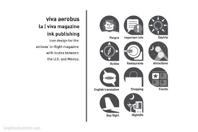
Some of the projects I've recently completed are a set of icons for Viva Aerobus' En | Viva magazine. I got to work with some very talented people on that project. The challenge there was creating icons that would communicate in both Latin and American cultures, without the need for words.
Late last year, I completed work on the logo evolution for the Lion's Club International. Initially, the agency Lipman Hearne hired me to illustrate the lions' heads, but as we got further into the project, I contributed to the whole logo design. That was interesting because it is such an American institution and has had an established look for quite a long time. Fortunately, that has led to additional assignments with the agency.
As a logo designer/illustrator, I have some work for a college in the Southwest that is having me redesign their sports team mascots. There are three different mascots, and they were trying to get a more cohesive look for the group. That should get approval and released very soon. Stay tuned for that one.

Which of your projects are you the most proud of? And why?
It's hard to say really, because that changes all the time, but I did a series of promotional logos for Purina Latin America a few years ago. I think there were about 12 total to produce with a very short time frame. I had 3-4 days from start to finish as I recall, because of the time needed for Spanish translation. I was the sole designer working on it, and I managed to crank out the entire series within the deadline, with some of my best logo work to date. Not all of them were used, but it was a challenging assignment. You didn't really have time to doubt your initial thoughts, just get them down on paper. As it turned out, my gut instincts turned out to be pretty spot on. Part of why I am proud of the work was the overall task, the other were the results I was able to produce. Sometimes you surprise yourself.
Are there any areas, techniques, mediums, projects in your field that you have yet to try?
Fortunately for me, I've tried a very wide range of mediums and project categories over the years. One of the things I haven't tried, is working in animation. Whether in After Effects or Flash, that would be cool to try. I'm very open to new techniques. That's the great thing about our industry, there's always something new around the corner to learn.
Any advice to the novice designer/ illustrator?
Pay your dues. Be honest. Work hard and promote yourself. Avoid burning bridges. Always, always, always work on your portfolio. When you make mistakes (and you will), try and learn something from them.
What makes a designed piece or illustration successful?
How does the communication make you feel when you view it? Does it evoke the emotion or action that was intended? To me, it's not just the technique, it's the concept, the color palette, the message–the whole package. Good work should trigger an emotion or an action with the viewer, whatever the medium – whether it's advertising, editorial or collateral.
What do you do to keep yourself motivated and avoid burn-out?
It's very easy to get down on yourself – especially when you see so much great work out there. Time away from all of this stuff is always a good thing – especially now with all the ways you can use to stay connected. Sometimes, it's just too much already! I try to get out on my mountain bike and bomb a few trails a few times a week to stay fit and keep some mental balance. While you're cranking up the climbs, you can sort things out in your head.
As we've all experienced in this industry, there are some projects that try and suck the life out of you. When the client gives you the parameters – whether it's budget, colors, preferences or whatever, I work very hard to get the most out of the project. Whatever constraints are presented, I ask a lot of questions and try to maximize the production value out of every piece. Most of the time, I can get something I'm proud of and want to show in my portfolio. THAT'S what keeps me going. Not just the imagery, but the challenge of getting the best out of the situation – for the client and myself.
Finish this sentence. "If I weren't a designer/illustrator I would have been a..."
an out-of-work comedian.
And finally, what is the best thing on prime-time TV right now?
I'm not much for the weekly drama network stuff. For me, it's gotta be Mythbusters, Dirty Jobs or The Office.
