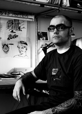
My name is Martijn Rijven, I was born in Rotterdam and after 34 years
of moving around to and living in various cities in various countries
I now run a one-man design/illustration/animation operation out of
Amsterdam under the name of BOLTgraphics. I am happily married to
Sandrijn. Turn-ons: cleanliness, apples and irony. Turn-offs: crystal
meth, pavement and irony.
http://www.boltgraphics.com
http://boltgraphics.blogspot.com
http://www.youtube.com/user/BOLTgraphics
When did you first decide to become a graphic designer/ illustrator? Was there a pivotal moment?
As is the case with most illustrators, I too have been drawing "ever since I can remember". So drawing was always there and I also knew I was going to end up in a visual / creative profession quite early on (either that or being a cook I seem to remember). When it came to choosing an education and 'a future' though, I realised I wasn't too sure about turning my hobby into my job. Out of fear of getting bored with it and being stuck without a hobby (so something to enjoy and to relax). So I chose to do typographic and graphic design which was sort of a parallel to art plus it somewhat limited my chances of me ending up a "starving artist"...
Who or what inspires you?
Approaching this question philosophically I would say: life. A more practical (and less lame) answer would be: For self-commissioned stuff it can be almost anything. Sometimes I make stuff just to try out ideas, for instance when I see something or notice how light can work in a specific way I think "ah so that's how that looks" and then I go into the studio and try to do it. Which then develops into work. Some other times it can be just a weird story or a thought that pops into my head. Even things that annoy me to death (and there are quite a few things I have to admit) inspire me in a way. For commissioned work it's usually (with some luck and somewhat depending on the job) research into the subject matter that inspires me the most. When I'm stuck for ideas I usually just hit the books.... well the Googles really. Reading into subject matter usually makes the images and ideas just flood in. Oh and looking at the paintings of the old masters in real life always gives me a nice feeling which makes me want to start producing stuff.
Where does your training come from? Self-taught? College/Art School?
My illustration is basically self-taught because even-though I went to arts college I did graphic/typographic design, there was hardly any focus on illustration/drawing/painting etc. Just the basics. When I got out of college I did some internships and quite soon after I went independent doing illustration and (limited) animation besides design.
In 2001 I did a short stint at House Industries in Wilmington, Delaware and that's where I met Chris Gardner. He showed me the basics of using a brush for inking and that really inspired me to develop my skill and style. So after that, illustration more and more became an important part of my business and it's been an ongoing struggle for improvement ever since. I think most, let's say 'serious' illustrators (and designers for that matter) are constantly looking to hone and improve on their skills. There's always studying and experimenting that comes with for instance new technical developments, new software or even just having a critical eye for what you (and others) make. So the training as such never really stops and in that respect I'd have to say I'm mostly self-taught...
How do you keep "fresh" within your industry?
To be honest I'm not sure what keeping fresh in the industry means. It try to keep an open mind and always try to improve at what I do. I don't really follow the trends, but I don't really focus on being and innovator either. I read books, study work (my own and other people's), practice, learn new software, go to shows, museums. I'm constantly, quite consciously, looking at stuff basically. Never really consciously worked at developing a style. That comes out automatically I think through the tools you use and the way your mind works. Besides that I also like to think the job dictates the look and feel of the work, so sometimes it becomes really graphic and 'flat', other times really colourful and flashy. I do what I do and let the industry worry about my freshness I guess.
What are some of your current projects?
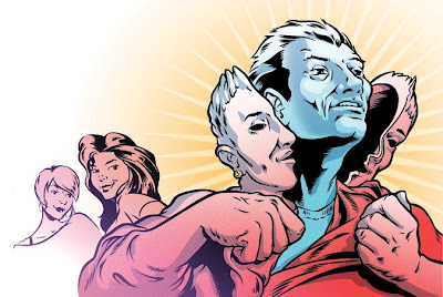
I'm really focussing on animation at the moment. I have been doing little animations in Flash ever since it came out, but recently I've been getting into more 'serious' animation. Making it connect to music, getting more fluidity and depth into them. Also just honing the skills again. Illustration is something that will never go away but apart of the fact that animation is something I've always been interested in, I also think that with tv-screens and 'jumbotrons' replacing posters and billboards everywhere, it's a handy skills to have. Besides the animations I am chronically trying to finish typefaces I've been working for way too long.
Which of your projects are you the most proud of? And why?
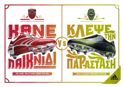
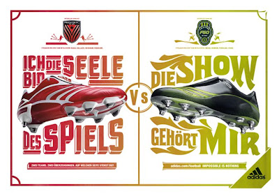
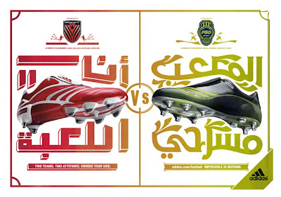
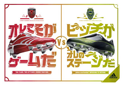
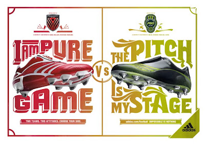
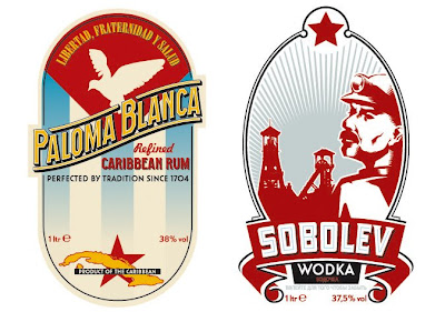
The Adidas "Predator vs. F50" campaign I did for 180 Amsterdam in 2006 is definitely one that I'm very proud of. In that job I hand-drew the lettering for two different print campaign designs, that all had two pieces of lettering on them and all of this in 24 different languages, besides English, German, French etc. (all the big western ones) there were 3 different Chinese dialects, Japanese, Korean, Arabic, 2 Cyrillic, Greek... the list goes on. So it was a ton of work. With all kinds of exotic lettering, making it all work in the same styles, keeping the art directors at 180 Amsterdam (the ad agency that commissioned me) and all the local and global clients happy and still keeping the quality up as high as I could.
Are there any areas, techniques, mediums, projects in your field that you have yet to try?
For a while now I've been trying to get away from my Mac a bit more. I do most everything on paper apart from the colouring, but I've been looking to get some more texture and warmth in my colours and then you just have get your hand dirty. Computer generated stuff (texture brushes and the like) will always look like, well computer generated stuff... Then again I've also been looking to integrate more computer generated material like 3d stuff into my work. I guess more experimentation is needed in any case. As I wrote earlier I've been really concentrating on animation lately too. Trying to do what I do for print (combining illustration and hand drawn type) but then adding the dimension of time. Especially in typography I am looking for new interesting ways of adding time.
Any advice to the novice designer/ illustrator?
Hmm let's see, eat well, plenty of fibres, exercise, regular showers, wash you hands before and after dinner, no running with scissors, relax, don't worry too much about being cool or the next hot-shot Stefan Carson or James Biskup... Don't look too much to other designers / illustrators for 'inspiration'. You already are a designer so why not find out what architecture, photography, sculpture, nature, choreography, music could make you think of. I don't like these 'design-books' it seems to have cut design loose from other disciplines. Architecture, product design and graphic design (and illustration and even music for that matter) used to 'leach' off each other much more in the old days. Designers and creatives used to react more to what's going on around them.... but maybe that has also changed because of clients and their attitudes have changed. But I'm rambling and getting off topic....
Just a bit more advice to tie this one up: Keep an open mind don't limit yourself with the idea of having to develop a distinct style. Having a style can be very restricting. It could make you more recognisable for potential clients, but it can also badly limit the amount of clients that want to use your services.
What makes a designed piece or illustration successful?
The simple answer: when it does it's job. When it fulfils the brief and does what it is intended to do (inform, attract attention, warn, mesmerise whatever). A lot of people (both designers and clients) don't seem to get the difference between "beautiful" or "nice" and "good". Or "ugly /
boring" and "bad" because that's an important thing. The one thing is objective and the other is subjective. In the olden day (imagine the voice of grandpa Simpson here) clients wanted work that would set them up for a couple of years and were willing to cough up a nice bit of dough for it too so it had to be really good... nowadays that seems to have changed to clients just want something that looks 'cool' or 'fresh' for a couple of months for not too much cash. So that way when it's worn out and out of vogue they still have some cash left to have some new tat done up...
Ok that's a bit of a sour comment but that has happened to a certain extent, I feel. Now (to get to my point) the definition of a successful illustration or design has changed. Or to be more exact, I
believe there's now a difference between what clients would consider successful work and what illustrators and designers would think it should be. So to me I think it has to be good (in the old way). It has to tell the right story in the right way and although it also has to be somewhat pleasing to the eye the look of it still dictated by it's function. So function over form kids. Sorry for boring you.
What do you do to keep yourself motivated and avoid burn-out?
Keeping motivated and avoiding burn-out are 2 different things to me. To avoid burn-out I'll do anything that has nothing to do with making money. I like to do sports (although you might not think so by the look of me) I ride BMX, do aikido and go to the gym regularly. Sports are a great stress release for me. Besides that there's music. I play in a hardcore punk-band and I love to go see shows. Music really helps me get my mind off my work which in turn helps me have fresh
look when I return to it. The thing that motivates me to keep at it is mainly this internal kind of anger. It sounds really negative, but it's not, it's just the only way I can describe it. It feels like an urge to keep fighting. Not quite sure what the fight is for though. For independence I guess...just fighting out of fear for ever having to be stuck in a 9 to 5 life.
Finish this sentence. "If I weren't a designer/illustrator I would have been a..."
I used to always say something like: "a patient on psych ward" But to be truthful I would have liked to be clever enough to be a biologist or a physicist. I've always been mesmerised by nature and physics. On vacations I sometimes spend hours just looking at clouds and weather especially when there are thunderstorms brewing) like a retarded monkey, just the look of the things.... fascinating.
And finally, what is the best thing on [prime-time] TV right now?
The off-switch.
