WW #9 Heat it Up!

WW#9HeatedDreams_SaK 002

Bev is the Challenge Hostess this week and she chose to "Heat it Up, Baby!" Get out your heat tool, and use it on your project.

Crinkled Ribbon, Emboss, Emboss Resist, just don't burn your fingers!

We would love for you to play along in the challenge with us this week! Just upload your card/project to your blog or favorite online gallery and link it to today's post. You'll have a chance to win a 40% off coupon for your next purchase!

For all the details about playing along and a chance to win and what the design team members have created today, please visit the Rubbernecker Blog.

WW#9HeatedDreams_SaK

The time collage was embossed using detail black embossing powder on the designer paper. Then, the edges were swiped with the embossing pad and embossed with Distress Tea Dye EP. The designer paper behind the time collage is also from the same 7gypsies paper collection, and I lightly stamped the french script randomly. I love the soft edges the distress powder gave the black embossed image and the cherub face on the DP that was positioned under the small clock on the collage. (use a stamp positioner to get an image exactly where you want it when using a paper with a pattern)

Stamps: Time Collage, ATC Dream text, French Letter Background

Paper: 7gypsies Gypsy Market DP, Prism Sunflowers Dark, Blush Red Dark

Ink: Distress Embossing Pad, Distress Black Soot

Accessories: Metal corners, clock Faces, Brad, Black EP, Distress Tea Dye EP, Heat Gun

Kittie Kit Release & Blog Stroll

The Stroll starts at the Rubbernecker Stamps Blog where you will find the rules on how to win one of the sets being released today or even possibly the GRAND PRIZE. If you haven’t started at the Rubbernecker Stamps Blog, you should go there now in order to not miss anything.  Winners will be drawn on Friday, 12:00 Noon.

Here is my phrase clue for the GRAND PRIZE: Rubbernecker

The Blog Stroll continues at Sherry’s Blog where you will find the next phrase clue.

Kittie Kits Release_SaK

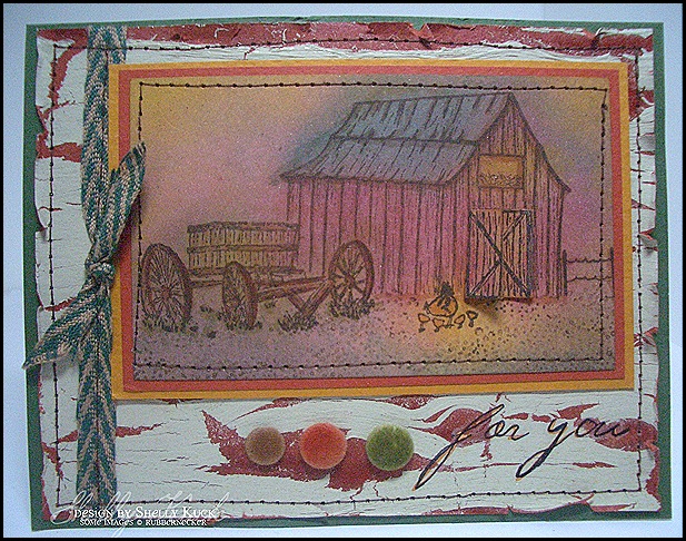
Today’s card features the 2 new Kittie Kits, Farm Scene #8 & Chicken Coop #7.  I used the Master #2 set for the gravel.  The crackle paint background was created by painting the cardstock with Ceramcoat crackle medium and when almost dry, coating the layer with Sandstone acrylic paint.  the Images were masked and misted with distress reinkers and then color was sponged on while the layer was still wet.  The sentiment is an SEI rub on.

The barn doors were stamped and layered on the top of the barn using a gate fold opening.  

Prism Cardstock: Cream, Sunflowers Dark, Desert Coral Dark, Herbal Garden Dark.

Ink:  Stazon Jet Black, Distress Pads & Reinkers/Scattered Straw, Fired Brick, Pine Needles, Vintage Photo

Ribbon, Flocked Brads, SEI Rub On, Crackle Medium, Acrylic Paint, sewing machine.

Wacky Wednesday #8 Button Challenge

WW#8Buttons_SaK

Candy is our challenge hostess today and she chose a button or chipboard challenge. Buttons worked perfectly with the new Kittie Kits to be released tomorrow. You won’t want to miss the blog stroll and fun we have in store for you, so be sure to stop by Thursday 4/23 for all the details.

My card started by making a crackle paint background. Prism Desert Coral Dark CS was covered with Ceramcoat Crackle Medium. When almost dry, a layer of Sandstone acrylic paint was brushed over the top. The key is to use minimal brush strokes and paint in one direction. The rooster and chicken panels are new images from the new Kittie Kit Chicken Coop #7. The chicken tracks and gravel are from previously released kits, Scene #3 & Master #2. I used Distress reinkers for the color wash and then lightly highlighted the images using Copic Markers.

Stamps: Kittie Kits- Chicken Coop #7, Scene #3, Master #2

Prism Paper: Cream, Desert Coral Dk, Suede Brown Dk, Blush Red Dk

Ink: Versafine Vintage Sepia, Distress Reinkers- Vintage Photo, Scattered Straw, Dried Marigold & Fired Brick. Copic Markers

Accessories: Ceramcoat Crackle Medium, Acrylic Paint/Sandstone, Buttons, Raffia, Sewing machine.

Today we will be giving away one 40% Off Certificate for your entire order at Rubbernecker. In order to qualify to win, you must post a link to your card/project on the Rubbernecker Blog by Monday April 27, winner will be announced on April 28.

Check out what the design team has done this week:

Bev - Savor the Journey

Broni - Splashes of Watercolor

Candy - Candys Land

Joan - Stamping with a Passion!

Jules - Stampin with Inky Fingers

Kittie - Kittie Kraft

Linda - Linda’s Works of Heart

Sherry - Walkin' on the BAD Side!

Wacky Wednesday #7

 WWIC_SaK 004                                                        

Juliana is hosting the challenge today and she decided on an inspiration piece. 

The possibilities are endless with this one, stop by the Rubbernecker Blog for all the details & play along with us!

6a010534a21306970c0115701e0962970b

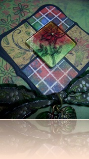
I had so much fun with the inspiration that I made 2 cards to show you today.  The first (shown in the close up view) shows the faux bleached inchies combined with 7gypsies  Designer Paper.  The wildflowers & sentiment were stamped on the same paper as the floral squares.  I stamped the sm. flower from the wildflowers set onto a Tim Holtz Fragment and then used alcohol inks on the back.   The beautiful ribbon is also from 7gypsies. 

WWIC_SaK 001


Stamps:  Rubbernecker Wildflowers Set, Grid Background

Paper:  Prism Black and white, 7gypsies Gypsy Market 6x6 paper pad

Ink: Stazon Jet Black, Alcohol Inks/rustic Lodge set & Metallic Gold.  Distress Fired Brick for sponged edges. 

Accessories:  7gypsies Hudson Valley Assortment, Tim Holtz Fragment, 1” square punch, corner rounder, Spellbinders Labels 1 die.  Glass leaves, Jump ring, Clear EP, craft iron.


My 2nd inspiration card uses a torn strip of the same faux bleached panel I made, but it looks so different layered on the blue DP vs. the green DP.

WWIC_SaK 003


 6a010534a21306970c0115701e095d970b


Stamps: Rubbernecker Grid Background, Collage (can’t find the name, but I will edit it in)

Paper: Prism simply Smooth White, Desert Coral Medium and Dark, Mystic Dark.  7gypsies 12 x 12 savannah collection Designer Paper

Ink:  Adirondack Pigment Denim, Terra Cotta.  VersaMark, Alcohol Inks/rustic Lodge set.  Distress reinkers/Weathered Wood and Tea Dye.

Accessories:  Clear Embossing Pwdr. Craft Iron, Perfect Pearls copper, Black Hemp Twine, Making Memories word washer, SEI rub on (remember) vintage postage.  I hope you decide to participate in the challenge, Happy Wednesday to you!

Friend in all Seasons

RNDTFlower Silhouette_Framed Friend_SaK 001

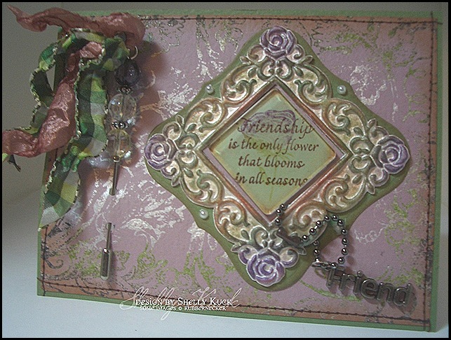
I can’t help myself.  Here’s one more card using the newly released Flower Silhouettes set from Rubbernecker Stamp co.  For this card, I started with Prism papers and a decorative foam frame that was picked up at the $ store a couple years ago.  The frame was white, so I first added Adirondack Paint Dabber/Pearl.  When dry, I sponged Stazon Timber Brown, Royal Purple & Olive Green.  The frame was layered on a Spellbinders die from Labels 1 (3rd from the largest)  The die was the perfect size and shape for the floral frame!  The center of the frame has cardstock in Wizard Light and then a 1 1/4” square of Herbal Garden Light.  I stamped the sentiment using Stazon Timber Brown and then the flower from the row of flower pots in the stamp set was inked with Distress Milled Lavender, Dusty Concord & Shabby Shutters.  I did stamp off on scrap paper once before stamping on the layer so the sentiment stood out and not the flower.  A Tim Holtz Fragment was layered over the top of the sentiment square and is attached using Glossy Accents.  Flat pearls and the Friend Charm on ball chain finish off the layer.  The background was created using one of my all time favorite stamps – Baroque Background.  I dabbed the entire stamp using Adirondack Paint Dabber/Pearl, then dabbed around the circumference with Lettuce and then Espresso before stamping on the layer.  When dry, I punched 2- 1/8” holes and added a stick pin with May Arts ribbons and then sewed the layer to the card base.  Supply list is below.

RNDTFlower Silhouette_Framed Friend_SaK


Stamps:  Flower Silhouettes, Baroque Background

Paper:  Prism Wizard Light, Herbal Garden Light & Medium

Ink:  Stazon Timber Brown, Royal Purple, Olive Green.  Distress Tea Dye, Milled Lavender, Dusty Concord, Shabby Shutters.

Accessories, etc.:  Adirondack Paint Dabbers, Pearl, Lettuce, Espresso.  Spellbinders Die Labels 1, Decorative Frame, Ball Chain, Friend Charm, Stick Pin, May Arts Ribbons, Tim Holtz Fragment, Flat Pearls.

Blog Stroll Winner

And the winner of the Flower Silhouettes stamp set is:

Deb Felts! 

Deb said...

Hi Shelly! Your card is stunning...beautiful textures, colors, and such a softness! Love it! I have always loved your style!
Mothermark and I were just sayin' yesterday that we missed you, so it is really nice to see you! :) Hope to see you again soon! Thanks for the chance to win a set!

Congratulations Deb!  Email me your address so I can get your set shipped to you.

Thanks for playing along everybody, it was a blast!

Spring Silhouette

RNDTSpring Silhouette_SaKGood Morning!  If you are visiting me before Noon EST you still have time to qualify for the giveaway of this stamp set.  Just click here for the details and leave a comment on that post to qualify.  If you start at the Rubbernecker Blog and gather the clues for the phrase, you could qualify for the grand prize drawing as well.  Remember, Noon EST 4/10 is the deadline.  The winners of the individual stamp sets and the grand prize will be announced on the Rubbernecker Blog after noon Friday 4/10/2009

Here’s another sample using Flower Silhouettes now available from Rubbernecker Stamp Co.  The background was left over from a tutorial I had done a while back, the details of the acrylic resist can be found HERE.  The background was layered on Prism papers (see product list below)  The flower pots were inked with Dew Drop pads combining VersaMagic chalk ink and Brilliance Pearl ink.  I just layered the colors from lightest to darkest pressing the pads directly to the rubber until I got the look I wanted.  The layer was over stamped using Distress Old Paper ink/Screen BG stamp and then the edges were torn and sponged with Distress Milled Lavender & Dusty Concord.  After adhering it to the background layer, I added the grid & ribbon and sewed the together.  The card was finished with the epoxy alphabet.  I hope you like it!

Stamps: Flower Silhouettes, Screen & Baroque Backgrounds

Paper:  Prism White Simply Smooth, Frosted Amethyst, Frosted Mint.  Magenta Grid

Ink:  Dew Drops- Versamagic Wheat, Sahara Sand, Sage, Hint of Pesto.  Dew Drop Brilliance Pearl Orchid, Pearl Purple, Pearl Lavender  Assorted Distress reinkers (see link above for the background details)

Accessories:  K & co. Epoxy Wedding Letters, May Arts dbl. sided satin Ribbon, Acrylic Paint Dabber/snow cap & Perfect Pearls for the acrylic resist.

Rubbernecker Blog Stroll

RNDT4-7S_SAK 005

The Stroll starts at the Rubbernecker Stamps Blog where you will find the rules on how to win one of the sets being revealed or even possibly the GRAND PRIZE. If you haven’t started at the Rubbernecker Stamps Blog, you should go there now in order to not miss anything. To win the Flower Silhouettes set revealed on my blog today, you must leave a comment ON THIS POST. A random number will be drawn on Friday, 12:00 Noon.

Here is my phrase clue for the GRAND PRIZE: STAMPS

The Blog Stroll continues at Sherry’s Blog

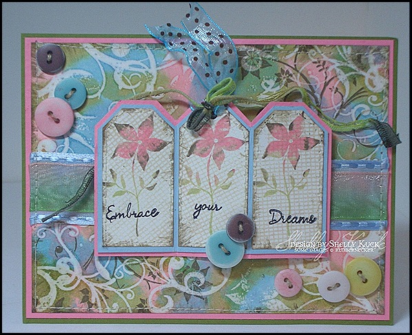
My card today starts with the newly released Flower Silhouettes set and the Flourish and screen backgrounds that were released last week.  I love how the flourish background goes with the new stamp set!  The technique is Faux Bleach using White Simply Smooth Prism cardstock.  The background was stamped in Distress Embossing Ink and embossed with clear powder.  Next comes the Alcohol inks from the new Country side collection.  The colors in the set include Shell Pink, Willow and Cloudy Blue.  To reveal the embossed image, place a sheet of copy paper over the top of the layer and iron off the embossing powder.  (you will see it melt into the copy paper)  The flourish from Flower Silhouettes was stamped in the corners using Distress Walnut Stain.  The layer was sewn on to Prism Baby Pink Medium and then Spring Willow Medium.  The layers of ribbon sewn on the faux bleach layer are both May Arts – 1” lt. blue woven edge satin & 5/8” variegated organdy.  My little tags measure 1” x 2” and were inked up with the rock n roll technique and the screen background was stamped over the top.  The words are all one long stamp.  I sewed the tags onto a layer of Prism Baby Blue Medium, trimmed and then layered on the Baby Pink Medium.  I accordian folded the tag and mounted it on foam dimensional tape for a little dimension.  The center tag sports more May Arts ribbon including a variegated green fiber and 1/2” Blue/Brown dotted organdy.  Lastly, the beautiful buttons are SEI from the Poppy collection.  The pink ones were smooshed into my Distress Worn Lipstick pad and air dried.  I sanded the edges of some of the buttons for a worn look.  They are sewn to the card using Linen Thread. 


Here’s a run down of the supplies:

Prism Paper:  White Simply Smooth, Baby Pink Med., Baby Blue Med, Spring Willow

Stamps:  Flower Silhouettes, Flourish & Screen Backgrounds

Distress Ink:  Walnut Stain, Antique Linen, Shabby Shutters, Worn Lipstick

Alcohol Inks:  Country Side

Miscellaneous:  Clear Embossing Powder, SEI Buttons, Linen Thread, May Arts Ribbons (Rubbernecker is now carrying May Arts Ribbon by the roll.  It will be available by the yard April 21) SEI Buttons, Foam Dimensional Tape

Wacky Wednesday Color Challenge

I have 2 color challenge cards today using new images available tomorrow 4/9/2009. RUBBERNECKER WILL BE RELEASING THEIR FIRST NEW SETS (excluding Kittie Kits) IN TEN YEARS! Mr. Rubbernecker has been working very hard drawing and developing his computer skills to produce these sets! You don't want to miss tomorrow. In conjunction with the release, we will be having a Blog Stroll where you will have a chance to win 1 of 6 sets revealed tomorrow, or even possibly all 6 sets (THE GRAND PRIZE). You'll want to begin your stroll on the Rubbernecker Blog tomorrow morning to make sure you catch all the clues!
Today the Design Team will be posting previews of the new sets for the challenge. Be sure to visit their blogs to see what you can expect more of tomorrow. 

Today we will be giving away one 40% Off Certificate on your your entire order at Rubbernecker. In order to qualify to win, you must post a link to your card/project on the Rubbernecker Blog using Mr. Linky by Monday, April 13. Winners will be announced on Tuesday, April 14. Have fun creating!

RNDT4-7S_SAK 004   Now for my projects.  Linda Duke chose Pink & Lavender for our challenge today.  Well, I started out making a soft pastel spring card and ended up here – my usual distressed/grunge look.  I had to make a 2nd project to sorta redeem myself.  Here’s the components of this card first:

Paper: Prism Rose Light & Wizard Light.  tim Holtz Distressibles Antique Ledger Paper

Stamps:  Flower Silhouettes Set

Ink:  Distress Walnut Stain

Distress Reinkers mixed w/ water and misted on ledger paper.  (Dusty Concord, Tattered Rose, Worn Lipstick, Antique Linen)

Embellishments:  May Arts Chocolate Ribbon, 7gypsies Chelsea Collection/lavender ribbon.  Prima Flowers, Pearlized Brad.


RNDT4-7S_SAK 002 My 2nd project and much more pastel and spring feeling is a  4 3/4” x 2 3/8” shipping tag.  It reminds me of a soft and sweet Easter Dress.  I started by covering the tag front with a Pearl Adirondack Paint Dabber.  When dry it was layered with vellum, sewn and trimmed around the edges.  The Floral pattern was created using watercolor crayons to color on the rubber, misting with water and then stamping on the vellum.  Next, I sewed the grid and reinforced hole strip on.  The edges were sponged, attached the ribbons, added the brad and the torn vellum strip with the rub on sentiment.   Here’s the supply list:RNDT4-7S_SAK 001

Paper: Shipping Tag, Hero Arts Linen Weave Vellum, Worldwide Spring Garden Vellum

Ink:  Distress Dusty Concord, Watercolor Crayons

Accessroies:  May Arts Ribbons, Pearl Brad, Magenta Peach Grid, K&Co. Rub On

Stay tuned for all the fun tomorrow and be sure to visit the Design Team to see their fabulous creations as well!

                                                                           You can click on the small photo for a closer view of the details.

Make it work Wednesday #17 Tuesday Edition

Make it work Wednesday is back this week, but it’s a day early because of exciting Rubbernecker posts on Wednesday and Thursday!

CIMG7299This week I decided to reorganize my Rubbernecker Unmounted stamps to make them more accessible.  Most of them were stored on photo refill pages in 3 ring binders.  (See MIWW #3 below) The system works great until you have to pull out 6- 3” binders to select an image for a project.  Not to mention the amount of space the binders take up.  I purchased 1 Scrapbook Solutions Photo Organizer box to experiment.  The Organizer retails for $9.99, but I used a Hobby Lobby 40% off coupon and got my employee discount to boot.  The box comes unassembled with the exception of the lid.  The box becomes quite stable after the assembled bins are placed in the box.  The system comes with labels for the tabs, but I just used my label maker to print my own. 


CIMG7301 Each bin will accomodate 7 background stamps with EZ Mount cushion on them.  My intention was to just store my backgrounds this way, then I took it a step further.  The photo refill pages cut down nicely to 4” x 6” without the clear film falling off the white base.  You can cut 3 out of each page and store stamps on both sides.  So, I organized my images by sets (like Kittie Kits) and by themes.

CIMG7312 I have 3 organizers filled now and LOVE this system.  The assembled box measures 4 1/2” High, 12” Wide & 13” Deep.  ( The cover is under the bottom in the photo, but pops on and off easily for dust free storage)

I have so many unreleased stamps, so I just took Post it Note flags and wrote the release date on them.  Now, I can quickly find the next release while still keeping them categorized. 

For previous make it work Wednesday's click on the links below.

#1 Ribbon & lots more (Clip it Up!)

#2 Cardstock/Scrap Storage

#3 DP & 12 x 12 Storage

#4 Punches & Wood Mounted Stamps

#5 Unmounted Stamp Storage

#6 Embellishment Storage

#7 Cuttlebug Embossing Folders

#8 Die Cut Storage

#9 Spellbinder Magnet Storage

#10 Ink/ Pads & Reinkers

#11 Sponges

#12 Punch Template Book

#13 Corner Desk Dish Rack

#14 Mini Mister Rack

#15 Alcohol Inks & Embossing Powders

#16 Embellishments Revisited

I hope these ideas inspire you to get organized. Remember, Make it Work!

Gated Thank You

RNBG's_SaK 001

RNBG's_SaK 002

Today’s card features a couple of the newly released Background stamps, papers and ribbon from Rubbernecker Stamp Co.  The backgrounds can be found HERE.  The card is a gate fold and measures 4 1/4” square.  Loopy brads were used at the center of each flap to secure the ribbon before the ends were tied in a bow.  I did heat the ends of the ribbon to add a little interest.  The metal/epoxy sentiment plate is attached with dimensional foam tape to the left flap.

Supplies:

Paper: Prism Suede Brown Dark, Mystic Light and Mystic Dark

7gyspies Designer 6 x6 paper pad Nottinghill

Ink: Distress Faded Jeans, Tea Dye & Walnut Stain

Stamps:  Wildflower Background, Abstract Floral Background

Accessories:  7gypsies ribbon/Savannah, All My Memories metal/epoxy sentiment tag, Loopy Brads

JOHN MALLOY


John Malloy is a commercial illustrator, fine artist, apparel designer, and comics artist/writer. Born in rural Pennsylvania to a cemetary caretaker and a coal-miner’s daughter, he began drawing cartoons and rock stars at around age 6. He later earned a background in painting with a highly skilled trompe l’oeil artist, and began a short-lived, albeit mildly successful career as an illustrator at 19 – working for alternative newspapers and Magic: The Gathering. In his early twenties, he authored and illustrated his very first graphic novel, “Amnesia”, which combined pen & ink, digital, and painted media. Shortly after its release, Malloy felt his work was too derivative of his influences at the time, and nearly gave up illustration and comics altogether. He worked as a graphic designer for Advertising Agencies, and spent a year as an art handler/truck driver, all the while painting and writing in his free time. In 2006 he came back to illustration by default, after starting work on a new graphic novel, “Channel One”, and a series of personal works as a means of pursuing a truly unique and personal style. Since 2007, his work has appeared in a variety of publications, including Business Week, Dazed & Confused, Faesthetic, Paste, and the award-winning hyper-culture magazine, Lemon. Preview pages from “Channel One” are on display at his website, http://www.johnmalloy.net, and he is currently seeking a publisher.


When did you first decide to become an illustrator? Was there a pivotal moment?

There have actually been a few pivotal moments for me. The first time was when I first got turned onto DC Vertigo comics and illustrator Dave McKean back in the 90’s, when I was a teenager. The big trend back then was heavily digital with a lot of Photoshop morphing and collage, and that kind of work was spilling over to editorial and advertising. It was really inspirational, but ultimately the heavy digital left me bored and unsatisfied. I wanted to do more work with a fine art aesthetic… something more personal and tangible, but still have my work be seen. Years later (2005-2006), I noticed a change in what could be done in the field in terms of detail, media, and the kind of gigs one could get as an illustrator. The line between fine art and illustration was blurring too. It hit me then that illustration could give me the best of all worlds in terms of opportunities to try new things, be creatively challenged, get exposure, and get paid.


Who or what inspires you?

For the most part everything, but more specifically my wife Amy, my Chihuahua Lucita, new music, comics, visits to the Whitney Museum in NY, and film.


Where does your training come from? Self-taught? College/Art School?

I went to a community college in PA where I had incredible teachers. One was a trompe l’oeil [super-realism] painter who taught me the basics of old master’s style painting, another was an art director for TV Guide back in the 60’s who gave me a great foundation in the ins and outs of what commercial illustrators do, from concept sketching to incorporating great design. Since then I’ve been self-taught via experimentation (and studying work) in painting, pen & ink, graphic design, and comics.


How do you keep "fresh" within your industry?

I think staying aware of what’s going on as much as possible is crucial for me, as well as staying on top of the infinite possibilities that lie ahead – and the limitless things I still want to try and do.


What are some of your current projects?

I’m currently working on 3 projects… the first is an album cover for the band, These United States. It’s the most detail I’ve ever put into anything commercial, and involves throngs of people in Chinatown hurling themselves into each other. Another is an editorial illustration for Paste Magazine about Booker T’s new album with Neil Young and The Drive By Truckers., whereI’m turning all of them into potatoes. I was also recently invited to do a piece as a reaction to an Asian artist’s work for Tiger Beer’s Tiger Translate Campaign and exhibition (http://www.tigertranslate.com).


Which of your projects are you the most proud of? And why?

I think for the most part I’m proud of everything I’ve done in the past 2 years.


Are there any areas, techniques, mediums, projects in your field that you have yet to try?

I’d really like to incorporate more graphite and pencil, and try to get many of the effects I can pull off in Photoshop by hand instead.


Any advice to the novice illustrator?

Well if there’s one thing I’ve learned so far it’s that there is no one-way, how-to guide to getting the kind of work you love. Trust your instincts!


What makes an illustration successful?

In general I think if it conveys the right message, makes a certain logical sense to the viewer, utilizes metaphors well without being clichéd, and is both challenging and inspirational it’s good to go.


What do you do to keep yourself motivated and avoid burn-out?

Hiking/being around nature and visiting contemporary galleries and art magazine/indie comics stores.


Finish this sentence. "If I weren't an illustrator I would have been a..."

Graphic designer, oil painter, or if I stayed in the family business, a cemetery worker.


And finally, what is the best thing on prime-time TV right now?

Ooohh, that’s a tossup for me… Lost and the Colbert Report!