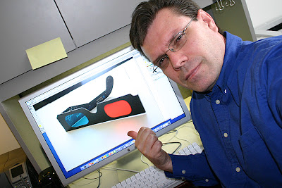
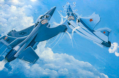
Hello! My name is Steph Doyle. I am a corporate in-house creative director for a non-profit by day, and an independent graphic designer/illustrator by night. I have been working in the creative business since 1979. I am married to an attractive and creative gal named Michele and am currently located in Frederick, Maryland, which is about 40 miles north of Washington, DC. My illustration and design work has been published in various Government, National and International publications. I have a passion for aviation and the history surrounding flight and I’m sure you’ll see a reflection of that passion in some of my work.
When did you first decide to become a graphic designer/ illustrator? Was there a pivotal moment?
I think the pivotal moment was when I was in the sixth grade. I was heavily into skateboarding and designed and built my own line of wooden skateboards. After being asked by my friends what kind of board I was riding, I decided to create a logo and spray paint it on the boards using hand-cut stencils made from masking tape and cardboard. The results were quite effective and drew a lot of attention. It was my first branding effort and I didn’t even realize it. I just knew I had a knack for it. Now that I reflect back on this effort, I wish I had kept those skateboards.
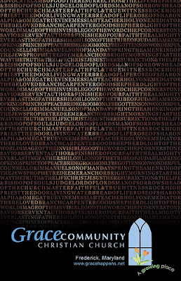
Who or what inspires you?
God inspires me. How the Earth looks from outer space. Looking at the early morning sky with all of its amazing color. Flight, and the fact that a huge composition of metal, glass and wood can fly safely at 600 miles-per-hour. Knowing that in this world, I am but a single grain of sand on an endless beach hoping to be discovered.
From a professional standpoint: Tibor Kalman really inspires me. After reading about him after his death, I discovered I was unknowingly following the same path he did and experienced a lot of the same trials and processes. I was never formally trained to be a graphic designer and after reading about Tibor, I felt reassured and confident in a world surrounded by degreed design professionals. What I found to be even more ironic is that Tibor employed an art director that shares my name, Stephen Doyle. That is part of the reason I go by the name of Steph rather than Stephen. I don’t think the design world is ready for two Stephen Doyle’s. Not just yet, anyway.
Where does your training come from? Self-taught? College/Art School?
I started working as a sign painter for Young Electric Sign Company (YESCO) right out of high school rendering large-scale type and illustrations on billboards by hand. From there I took many baby-steps to work my way up the career ladder over a long period of time. However, I did attend college courses and participated in art education programs along with continuing education throughout my career. I would have to say the best form of education I have received so far is through mentorship. I have had the pleasure of being instructed and criticized by many fine craftsman, designers, and artists of various levels of experience. My alma mater is The School of Hard Knocks. Fortunately, I never graduated, and I will always continue to focus on learning from others.
How do you keep "fresh" within your industry?
I actively network with other design and art professionals through organized meetings and conferences, read 10-12 professional publications per month, and participate in a few design forums online. I’m a member of the DC Area InDesign Users Group, the Art Directors Club of Metropolitan Washington, and several others. I also focus on the business side of our industry through such organizations as Creative Latitude and No-Spec.

What are some of your current projects?
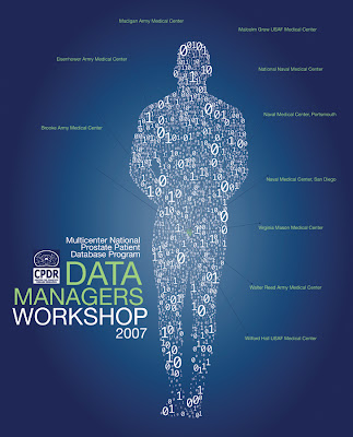
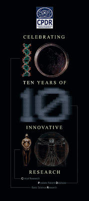
I am finishing up a huge graphic standards manual project for the Center for Prostate Disease Research to wrap up a major re-branding effort. On the freelance side of the coin, I just finished a brand identity project for a small aviation business out of Florida. I have a few web design projects in the mill, one for a homeowners association, and one for a private school. I am also in the negotiation phase of branding a business that sells gourmet and specialty meat products, which is turning out to be quite a challenge.
Which of your projects are you the most proud of? And why?
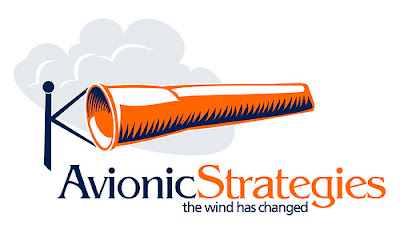
This is a tough question and I don’t want to appear to be taking the easy way out, but I don’t have any particular favorites, I am proud of them all. I wouldn’t produce work I wasn’t proud of. There are many different levels of pride I guess. But if I had to pick which area of my field I like the best, that would be branding and creating logos. I find it a thrill to see the successful results of an identity that I have created.
Are there any areas, techniques, mediums, projects in your field that you have yet to try?
I want to eventually try doing some Gocco produced illustration. Keith Bowman from The Design Bureau of Amerika does some interesting compositions using this technique and I have been intrigued by his work. I also want to get into silkscreen printing. I want to push screen-printing to the edge and do some wild experimental work with this medium on different surfaces like wood, metal and plastic.
Any advice to the novice designer/ illustrator?
Yes. Respect your elders. Seek out mentorship from those that have been in the business for a while and have already experienced the heartaches and growing pains. I know it saved me from a lot of disappointment and hurt. I always have to remind myself that there is going to be someone out there that is better at doing certain things than I am. The goal is to find out why they are better, embrace the challenge of working toward that level of experience, and then pass that knowledge on to others.
Secondly, don’t be afraid of continually interacting with other designers or artists. Whenever possible, solicit ideas and critique from others in the field. Many different ideas merged and polished by a collective team tend to be more successful than a single point of view. Often I find that people in our field love to throw in their two cents. Other points of view, no matter how much I may or may not agree with them, are a resource I can’t survive without.
What makes a designed piece or illustration successful?
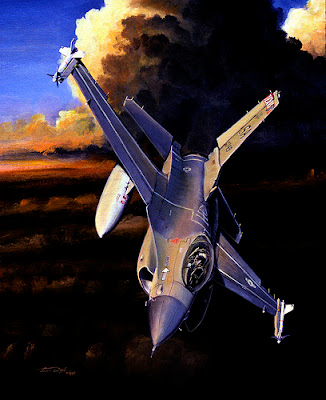
The piece must make a strong connection with the intended audience. I don’t care how cool a finished project may look to a group of designers or peers if it doesn’t convey the message clearly to the targeted demographic it’s a flop.
What do you do to keep yourself motivated and avoid burn-out?
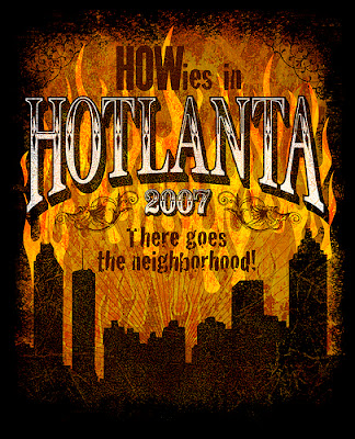
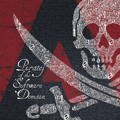
I participate in creative play and exercises, like say, SFG. Illustration Friday is another good forum for free exploration. And the HOWiezine on the HOW design forum is a great opportunity to break free with my talent. I also get a book, or “zine,” of my very own to see how all the different designers and illustrators solved a problem. These exercises are necessary for exploring topics or mediums that I normally wouldn’t on a regular basis. It all boils down to the freedom of expression each exercise offers and there is no client involved in the process to tell me to make changes.
And finally, what is the best thing on prime-time TV right now?
I enjoy watching CSI. The processes they use to solve problems are interesting and I try and take some of that away with me into the real world of my profession. The special effects are very convincing as well. There have been times that I have actually felt sick watching them explore a decayed human body for clues.
Related Links:
My work can be found at:
http://flickr.com/photos/delineatedesign/sets
Here is my blog:
http://stephdelineated.blogspot.com

